

Picking the Perfect Colors for a Professional Business Photoshoot
- Kailey Tucker
- Sep 2, 2024
- 3 min read
When preparing for a professional business photoshoot, choosing the right colors for your wardrobe and background is crucial. The colors you wear can significantly impact the overall tone of your photos, conveying confidence, professionalism, and approachability. Whether you're taking headshots for your LinkedIn profile, capturing branding images for your website, or updating your business card, understanding how colors work with your complexion and the intended message of your brand is key.
1. Consider Your Complexion

Light Complexions: Soft and muted colors like pastels, light blues, grays, and soft pinks work well for lighter skin tones. These shades complement your complexion without overpowering it, giving a fresh and clean look.

Medium Complexions: If you have a medium complexion, you have a bit more flexibility. Jewel tones like emerald green, sapphire blue, and deep purples are great choices. These colors bring out the warmth in your skin and add a touch of vibrancy to your photos.

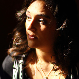
Darker Complexions: Rich, bold colors such as burgundy, mustard yellow, navy blue, and forest green are excellent for darker skin tones. These hues create a striking contrast that highlights your features, making for compelling and dynamic photos.
2. Think About the Message You Want to Convey

Confidence and Authority: Navy blue, black, and deep red are classic power colors. They convey authority and professionalism, making them ideal for leadership roles or positions where confidence is key.

Approachability and Warmth: Earth tones like browns, tans, and olive greens give off a warm and inviting vibe. These colors are perfect if you want to appear approachable and relatable, particularly in client-facing roles.

Creativity and Innovation: If your brand or role emphasizes creativity, consider brighter colors like teal, orange, or even a vibrant yellow. These colors can add a pop of energy to your photos and show that you think outside the box.
3. Coordinate with Your Brand Colors

Align with Your Brand: If you're using these photos for your business website or marketing materials, it’s essential to consider your brand’s color palette. Incorporating these colors subtly into your outfit—whether through accessories, ties, or even the background—can create a cohesive and professional look.
Neutral Backgrounds: Opt for neutral backgrounds if your brand colors are bold. A white, gray, or beige background ensures that you remain the focus of the photo while still maintaining brand consistency.
4. Mix and Match for Depth

Layering: Consider layering different shades of the same color to add depth and dimension to your photos. For example, a navy blazer over a light blue shirt can create a sophisticated and polished look.
Accessorize: Don’t forget about accessories! A tie, necklace, or pocket square in a complementary color can add interest to your outfit without overwhelming the overall look.
5. Consider the Setting

Indoor vs. Outdoor: If your photoshoot is outdoors, be mindful of the natural lighting and surroundings. Warmer colors tend to pop against natural backdrops, while cooler tones can create a harmonious and serene feel.

Studio Shoots: In a studio setting, you have more control over the lighting, so feel free to experiment with both bright and neutral colors. Just ensure that your outfit doesn’t clash with the background.
Final Thoughts
Remember, these are just suggestions. The most important thing is to choose colors that make you feel comfortable and confident. Whether you decide to follow these guidelines or mix and match to create your own unique look, the goal is to showcase your personality and professionalism in your photos.
By considering your complexion, the message you want to convey, and how your colors align with your brand, you can ensure that your professional business photoshoot results in images that are not only visually appealing but also true to who you are and what you represent.
Note: All images featured in this blog were created by the photographer using a paid AI membership, with full permission for use.


Comments